VersaWorks – Color Management
The history of printing with VersaWorks will help in understanding how to decide what are the best settings for RVW. Color primting starts with 4 color offset printing and VersaWorks started by emulating that color space. Sign makers were using cut vinyl colors applying cut letters to signs. When Roland’s printers came along – these more saturated colors were the colors sign makers were trying to emulate – and 4c offset colors were lacking.
The first approach to get “sign” colors was “solved” by using RGB colors. In the rendering step in VersaWorks – RGB and CMYK are color rendered differently – by going through a different paths – specifically – different “Simulation Target Profiles.” These can be seen in the “Quality Tab” – in the “Color Management” “Properties” at the bottom.
The reason RGB looked more colorful has to do with the “Simulation Target Profiles” for RGB – AdobeRGB1998.icc. This target describes a broader color gamut [the colors a space can describe.) The CMYK profile was designed to match offset presses – this “Simulation Target Profile” is USWebcoatedSWOP.icc. SWOP is a noticably crippled gamut that identifies the colors an offset press was capable of.
So – 15 years ago Roland users solved their crippled color space by designing in RGB utilizing the greater color space of AdobeRGB1998. Designing in RGB has problems mostly due to control. The mathmatics that takes the RGB file and renders it on a CMYK printer causes a lot of color control issues. Grays are hard to get nuetral; yellows often have speckles; blends can have odd intermediate steps. In short, colors become saturated, but control can be a real problem.
Roland quickly realized these issues and identified that the USWebCoatedSWOP.icc was the problem. Roland had two solutions.
One solution was Spot Colors. Roland created their own Spot Color library – the Roland Color System Library. This solution involved printing a chart for each media and using those colors. Spot Colors were dealt with by bypassing the “Simulation Target Profile” entirely – using preset ink settings. Roland ended up making color ink settings for Pantone colors as well. Using Spot Colors is a dependable way to make sure great sauturated colors can be printed. Users need to make sure the FILE FORMAT tab has the “Use Spot Colors” check box checked.
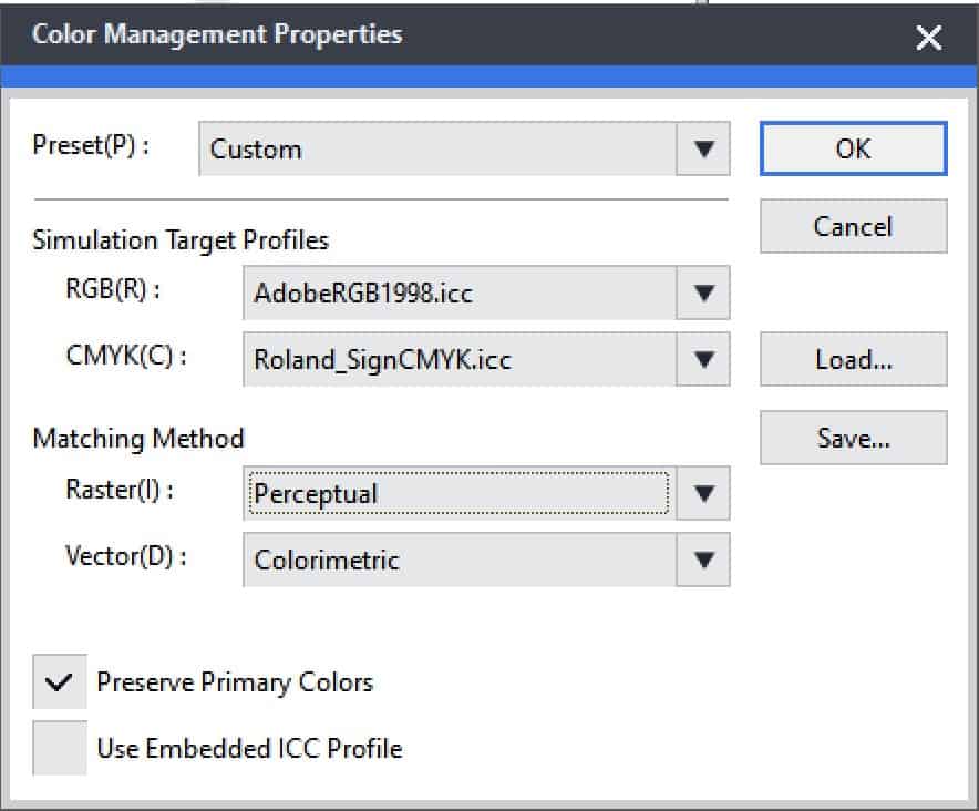 The second solution was for Roland to create their own custom “Simulation Target Profile.” They created a general preset called Max Impact. The Roland_SignCMYK.icc profile took into account the broader color gamut possible with the EcoSol Max inks over the standard 4c offset inks and process. They also made a Roland_SignRGB.icc for this preset – but as we will see below – they returmed to using the AdobeRGB1998.icc target for RGB. Examples of RGB white – 255,255,255 – using Roland_SignRGB.icc have been known to have a yellow cast. The suggestion here when using Max Impact is to use RGB- AdobeRGB1998.icc and CMYK – Roland_SignCMYK.icc. This will cause the preset to be changed to “Custom.”
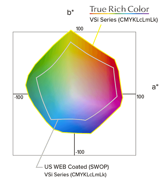 When Roland came out with the TrueVis Inks they had inks with even a greater color gamut. Roland developed new Simulation Target Profiles specifically for the capabilities of these inks – and boosted color on Max2 inks as well. The new preset is named True Rich Color, and True Rich Color(2). The target profiles are RolandWideGamut_CMYK.icc & RolandWideGamut2_CMYK.icc. A user will notice that AdobeWebRGB1998.icc returns in the RGB slot. The True Rich Color 2 came out with the introduction of Orange and Green inks.
OTHER NOTES: Matching methods settings are suggested as RGB=Perceptual; CMYK=Colormetric. This is most appropriate when RGB files are being used for photographs where a colrmetric setting might cause the photo to have slight posterizing effects. There is a “Use Primary Colors” check box – this will override a color targets tendency to add bits of color where they are not needed – Speckles in a pure yellow or red or green cast to pure grays. If this check mark is on – then a CMYK setting of 0,0,100,0 will make sure only the yellow channel is fired – no speckles. A dsignation of CMYK=0,0,0,50 – will make a black only 50% gray. Both these preserve that only one of the 4 primary colors are used as designated.