VersaWorks – Color Modes
Color goes from the rediculous to the sublime. One minute it seems under control and the next its wild and horrible. There are some basis terms that will eventually help control color and know why what is happening is happening.
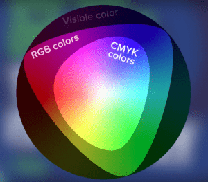
 RGB vs. CMYK: The first issue to address is color modes. The simple two ways color is often split up is by how it is made.
- RGB color is made by adding the three “light” color primaries to make white light. These primaries are Red, Green, Blue. This color mode is most commonly used by Monitors, TVs, Scanners, Cameras. This is the color mode of additive color.
- CMYK color is made by mixing the “subtractive” color or paints or pigments. When all three colors – Cyan, Magenta ,Yellow – are mixed together the reflected light is subtracted (or dulled) and we get “black.” Actaully, the “black” is not convincing nor crisp enough so the K – blacK – is added. Printers have used “K” for black instead of the “B” which may be confused with Blue.
SPOT COLORS: When printers did two color jobs – say black and Reflex Blue for example – they inked their presses with these colors “from the tin.” If a printed job wanted Burgundy – the printer used a color mixing guide and mixed the burgundy before placing it as burgundy on the press. Today, this use of spot colors is mostly done by T-shirt printer working with limited colors on one design.
Design software can design in RGB, CMYK, SPOT COLORS, (and LAB – Luminence, A Channel, B Channel – not really practical for designers – used for precise color designations.) Typically designers designate colors in RGB when they are designing for screens and CMYK and SPOT COLORS when they are designing for print. This divide is still a good approach for many reasons.
RVW & SPOT COLORS: Spot colors were designed to make separations by color. If a two color Spot Color job was designed – the printout would separate the the output into two color “plates.” If a CMYK job had a Spot color in it – the separations would be something like – Cyan, Magenta, Yellow, Black, PMS155. RVW uses the typical Spot Color separation routine to separate the CutContour, PerfCutContour, RDG_WHITE, RDG_GLOSS, RDG_METALLIC, RDG_PRIMER, VDP_name, etc. to add special functions to the workflow. The actual color of these Special Items does not matter – simply the exact case sensitive name and the designation as a spot color.
IN CONCLUSION: Choose your color mode for the output device the artwork is designed for. With Roland printers – use CMYK and Spot Colors for vector graphics – and keep photographs in their native RGB. Use Spot Colors in VersaWorks to utilize the special features. In the next post – suggestions will be made for getting better control of color output once the design modes have been established..

